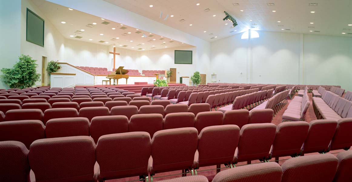
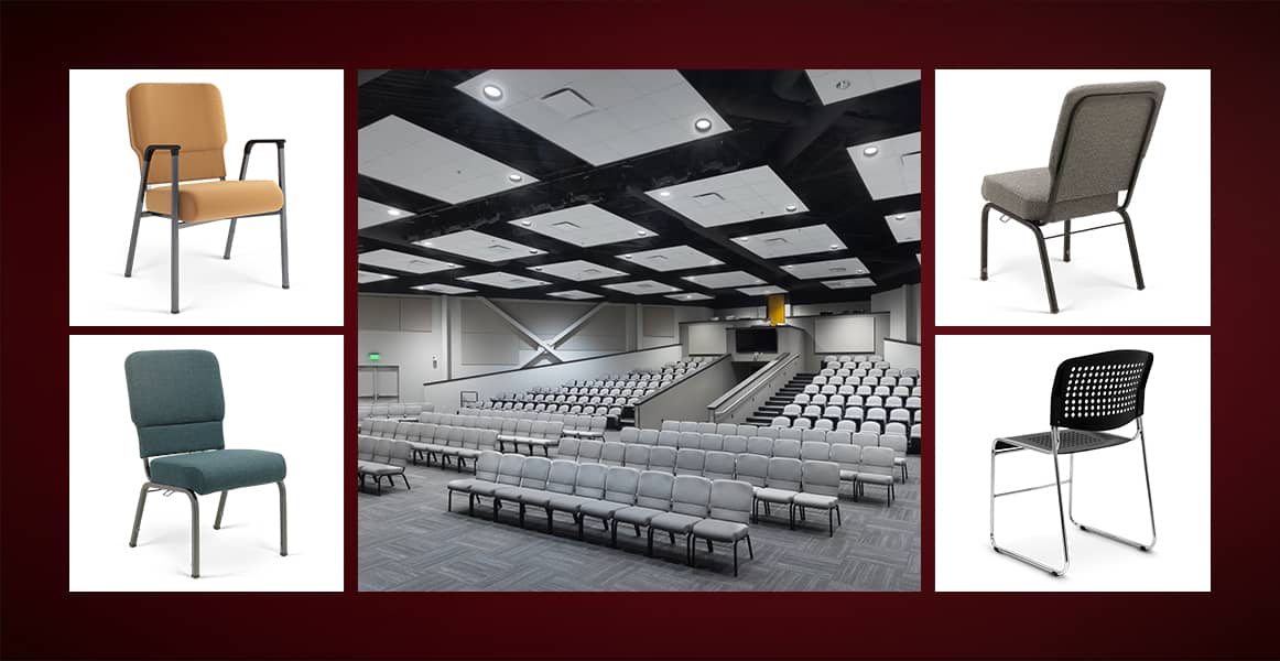
One of the top advantages of getting lightweight, stackable chairs for your church is that you can move chairs around into different seating layouts. Not only can the same room be used for multiple activities throughout the week, but you can also try out alternative layouts to accommodate events, like weddings and concerts, as well as fluctuations in expected attendance.
You’ll find different layouts change the degree of accessibility, the way the congregation views the stage, and the overall experience of those attending. You can add extra chairs for holidays and special events and then space chairs out more comfortably at other times, to avoid the appearance of a half-empty room. You may be surprised how much the seating can affect the way the worshippers engage with the service.
Keeping that in mind, here are a few examples of church seating layouts that will maximize space while improving the experience of your congregation.
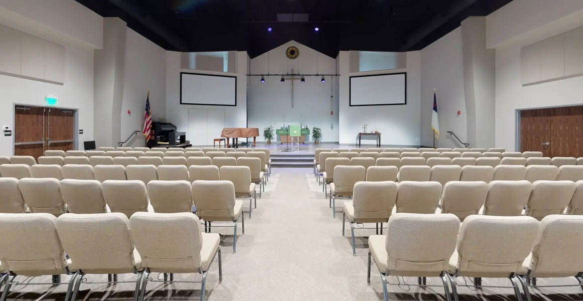
1. The classic center aisle layout
This church seating layout creates a wide, accessible path in the middle of the church that is open to everyone. On either side of the center aisle are rows of chairs. This layout can be even more effective if you are working with vertical space because the long, linear path can create a dramatic effect on the viewer. However, having one path may also lead to mild disruption due to latecomers. And it also means that there are no seats directly in front of the altar. This seating arrangement is traditionally used for weddings, special events, and services.
2. The angled layout
This layout uses rows of angled chairs to create a line of focus directly to the altar, allowing people to comfortably view the pulpit, altar, or stage without distraction. Like the center aisle church layout, it utilizes one big path between two sections of seating, which may suffice nicely for a small or formal space. People can easily access the seating before the service starts but may have little trouble coming or going after the service has started.
3. The multi-lane layout
If you are working with a space that is a little wider than it is long, you should consider adding multiple lanes, with two long rows of chairs flanking the middle lane and two thinner paths separating them from the smaller rows at either end. Depending on how wide your space is and how many chairs you may want to put down, you may be able to fit in two narrow paths at either end as well. However, this church seating layout may be problematic if there are columns in the worship area.
4. The circular layout
With a circular layout, the speaker and choir performers stand on a raised stage in the center of the room. This is an innovative design that is all but unheard of in older churches, but it’s slowly growing in popularity and is an idea used as far back as ancient Rome in theaters and sports arenas. More recently, it’s similar to the layout of Quaker worship meetings, which typically take place in a rectangular space where the person speaking stands at the center.
This layout tends to change the atmosphere of the service. Some feel it’s collaborative and welcoming and can inspire a greater feeling of community. Plus, everyone has a direct view of the person officiating the service.
5. The semi-circular layout
You can also have a semi-circular design, with rows of church chairs circling at least half but not all of the stage. This church seating style echoes the layout of Shakespeare’s original Globe Theater. It can feel a bit more traditional while still providing a feeling of togetherness and community. The semi-circular layout also offers the advantage of placing the rostrum, altar, or stage against the wall, which can be helpful when people move on or off the stage or approach the altar. It also places all electrical needs neatly against the wall. In addition, musicians and speakers will not need to pay attention to a 360º audience with this church seating layout.
Would you like to talk about how you could transform your house of worship with new church chairs or seating layout options?


